Doordarshan updates its logo after 60 years and here's why
Explore why Doordarshan, India's pioneering broadcaster, decided to revamp its classic logo, aiming to resonate better with younger audiences and modern aesthetics.
Doordarshan, India's public broadcasting service, began as an experimental service on September 15, 1959, under Prasar Bharati. Initially part of All India Radio, it became a distinct entity as television's popularity surged. Doordarshan expanded significantly by 1975, reaching across multiple Indian states and capturing the hearts of a national audience.
Symbol of Harmony
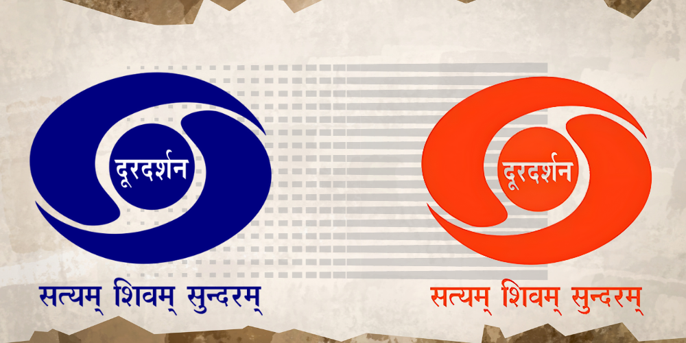
The original Doordarshan logo, designed by Devashis Bhattacharyya, a student from the National Institute of Design (NID), was selected by then Prime Minister Indira Gandhi in the early 1970s. The logo featured an abstract representation of the 'yin and yang' and was accompanied by the motto "Satyam Shivam Sundaram," encapsulating the broadcaster's vision to deliver content that was true, divine, and beautiful. This design was chosen from multiple submissions, symbolising a blend of traditional and modern aesthetic values.
Cultural Significance
The design, simple yet profound, was intended to resonate with the diverse cultures of India without aligning too closely with any specific meaning, hence avoiding cultural misinterpretations. This emblem of an all-seeing eye, as some perceived it, represented Doordarshan's role in offering a unified view of the world to its viewers.
Modern Transformations
Despite its enduring legacy, the Doordarshan logo has undergone changes to stay relevant with the times. Notably, the late 1980s and 1990s saw adaptations to accommodate new channels like DD Sports and DD News. Each version retained the essence of the original while adapting to new contexts.
Why Change Now?
Despite its iconic status, there's a growing sense that the Doordarshan logo needs a refresh to connect with younger audiences and reflect a more contemporary India. The decision to revamp the logo has sparked considerable debate, reflecting the deep sentimental value and historical significance associated with the original design. This sentiment is echoed by public figures like Ayushmann Khurrana, who expressed a desire to preserve the nostalgic value of the old logo.
A New Dawn with Saffron
The recent change to a saffron-themed logo aligns with a broader strategy to update the brand's image, aiming to resonate better with current and future viewers while retaining its core identity as a broadcaster for all Indians. This color shift is not just a design choice but a symbolic gesture towards vibrancy and a new vision for the network.
Balancing Heritage with Innovation
As Doordarshan evolves, the challenge lies in maintaining its rich heritage while embracing changes that meet the demands of a dynamic media landscape. The new logo represents this balance, promising a blend of traditional values and modern aesthetics. It invites everyone to be part of this transformation, ensuring that Doordarshan remains relevant and cherished in the hearts of Indians everywhere.

![[Funding alert] Digital lending platform Revfin raises Rs 100 Cr in debt round](https://images.yourstory.com/cs/2/31ee0510ca7c11eba975c529dced399e/MalvikaCopyofImageTagging52-1647263527421.png)